The lab-grown diamond category led with guilt sustainability badges, ethical disclaimers, carbon comparisons. None of it felt like luxury. Gleamoro needed a brand so visually confident, so considered, that the ethical story became secondary to the desire.
Brand Discovery & Positioning
We rejected the category’s default language entirely. Gleamoro was not built around what it avoids, it was built around what it creates. Brilliance. Elegance. A conscious choice that never feels like one. Not a movement. A house.
Central Concept · The Diamond Within the Mark
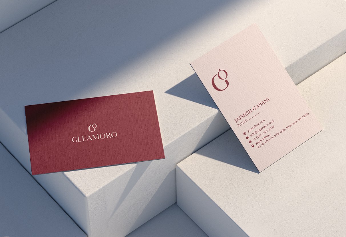
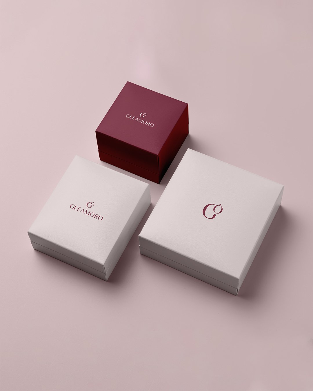
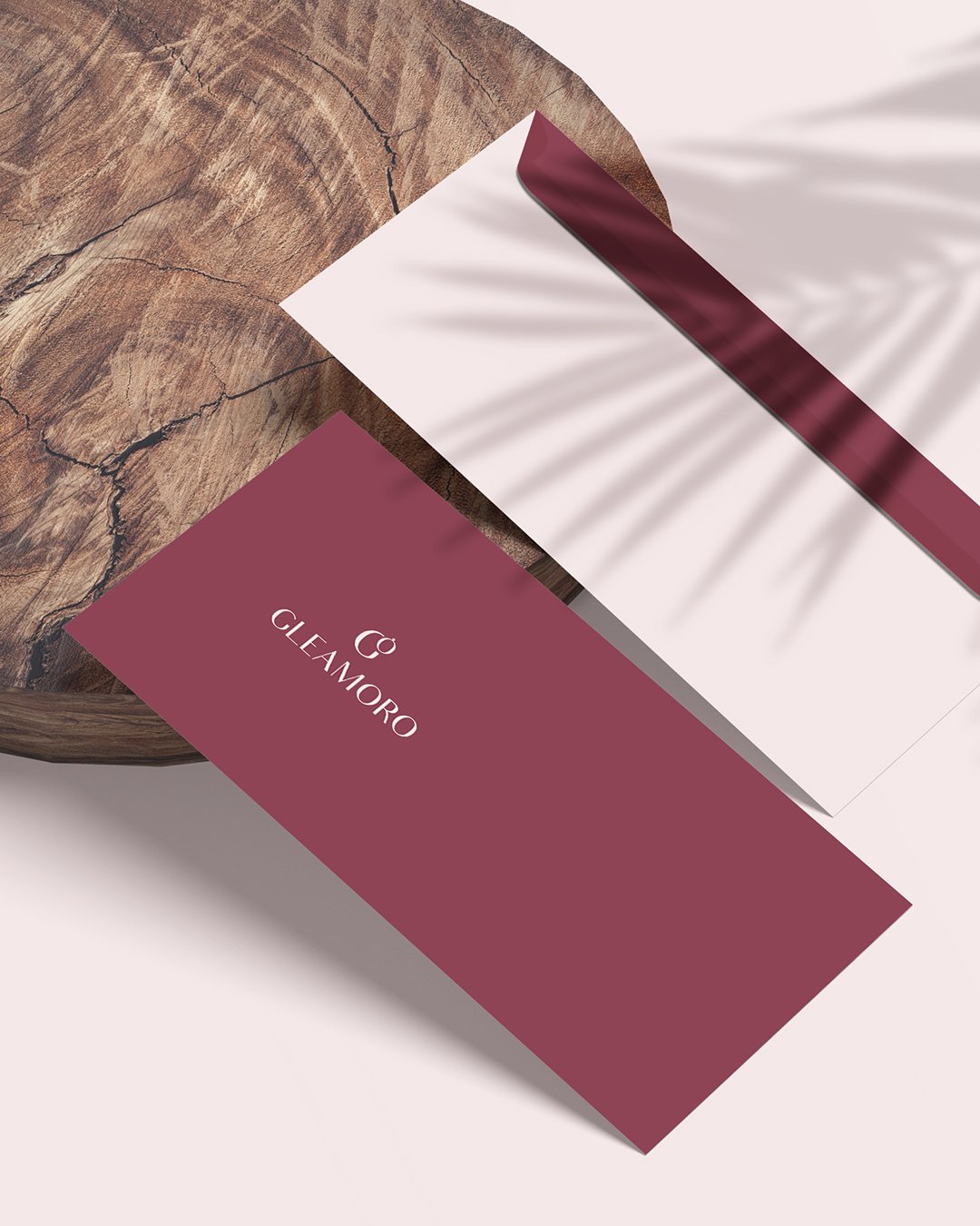
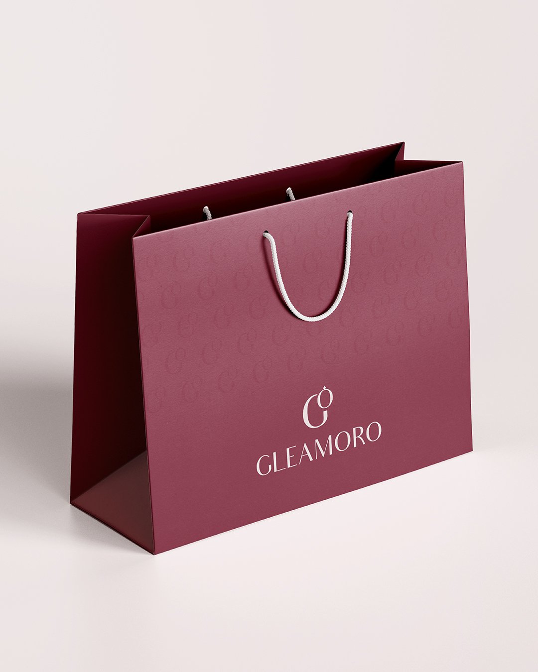
The G+O logomark “O” elegantly crowned by a diamond compressed the entire brand idea into a single symbol. Brilliance and eternity, made visible. Every colour, typeface, and packaging decision was built to make that mark feel inevitable.
Archetype & Personality System
The Creator meets The Ruler. Visionary craftsmanship anchored by regal authority. Sophisticated at its core, sincerity running underneath. Never cold. Never loud. A brand that carries itself like something that has already won.
Tone of Voice & Communication
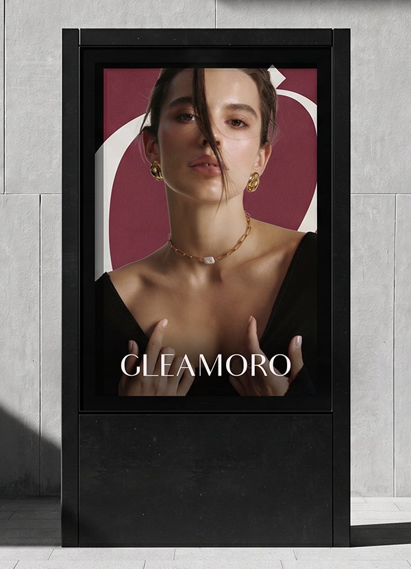
Effortless and quietly assured. Gleamoro speaks like a woman who chose this diamond because she wanted it not because she was convinced. No lectures. No disclaimers. The brand states its truth and lets the work do the rest.
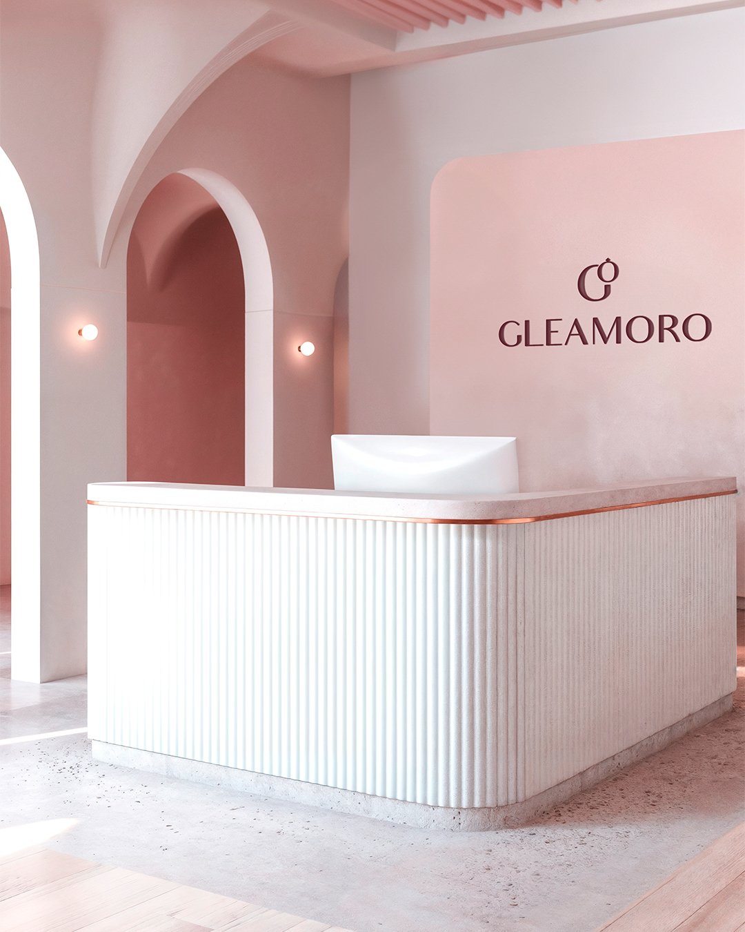
Visual & Content Direction
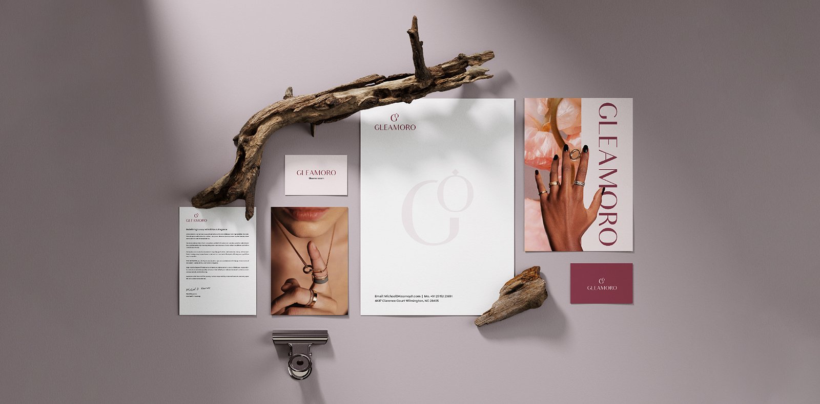
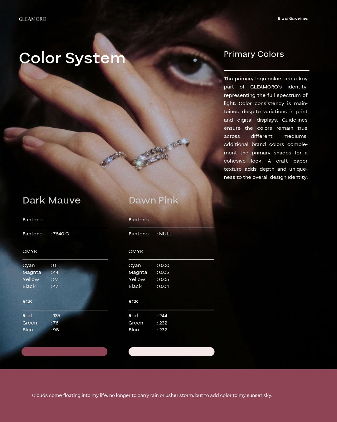
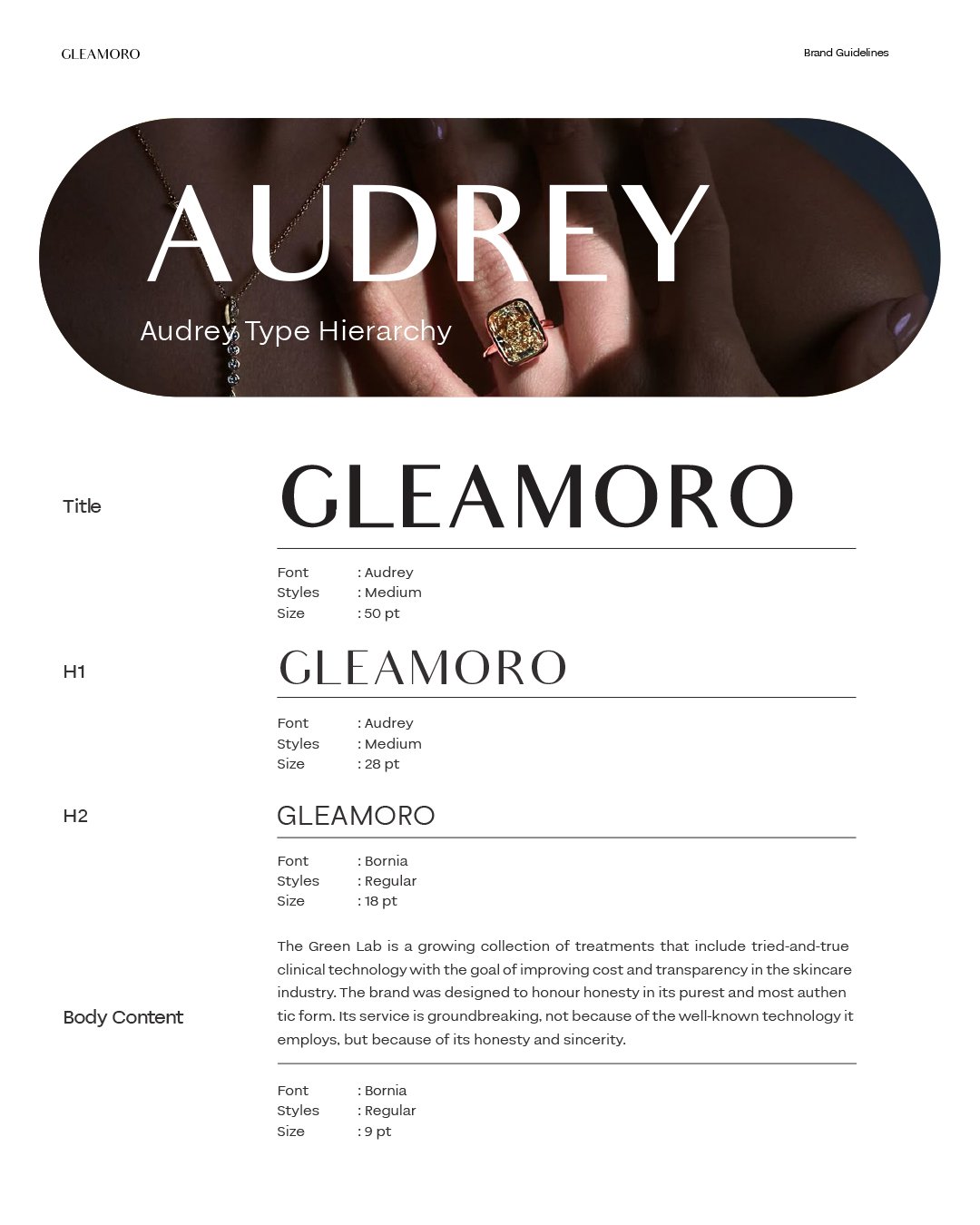
Dark Mauve and Dawn Pink. Bornia for structural elegance; Audrey for editorial warmth. The G+O monogram extended into a repeating pattern across packaging boxes, bags, tissue, and unified. Photography: natural light, warm skin, unfiltered the antithesis of cold studio diamond imagery.
Outcome
Logo system, colour architecture, typography, stationery, packaging, layout rules, image direction built from scratch, built to last. Gleamoro didn’t enter the lab-grown diamond market. It redefined what that market could look like.