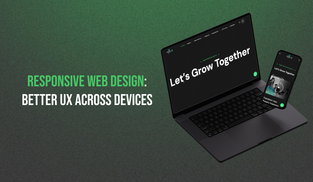
People access websites these days using a range of devices. Among these are tablets, cellphones, and desktop and laptop computers. Web design is consequently more important than ever. People are drawn to and kept on a well-designed website by its seamless device experience. Right here is where RWD, or responsive web design, helps. RWD guarantees the website appears and functions flawlessly on all devices. Here, we will discuss RWD and its advantages for the user experience.
Responsiveness In Web Design: The Current Need
Responsive Web Design is a way of designing websites that puts a lot of emphasis on making them device-friendly. These give you the best watching and interaction experience on many different devices. It uses pictures, CSS media queries, and customizable grids and layouts. These change the look and information on the fly based on the size and orientation of the device’s screen. It keeps the experience the same for everyone.
Importance Of RWD In Web Design
The internet moves quickly. Hence, responsive web design is a must. Companies must now more than ever adjust to the vast array of devices to remain competitive and relevant.
Enhanced User Experience:
Any web design should provide consumers with an excellent experience as its primary objective. RWD enables users to navigate the website fast, independent of their device. This smooth experience makes users happier and more interested. In the end, it leads to conversions and sales.
Improved SEO Performance:
Search engine results favor responsive websites above non-responsive ones. Results from search engines like Google give websites that function properly on mobile devices greater weight. This makes RWD an essential part of web design. With flexible design, you can make your website more visible and reach more people.
Cost-Effectiveness:
When you buy a flexible website, you don’t have to do separate plans and development work for each device. In the past, websites had different versions for mobile devices and computers. Now, RWD lets you keep up a single page that works on all screen sizes. It will help you save time and effort. It will also help you save money on web design and development.
Increased Accessibility:
As a bonus, responsive web design makes websites easier for people with disabilities. Scalable fonts, easy scrolling, and support for screen readers are some of the things that RWD has to offer. It ensures that everyone can view and use the website properly, regardless of their gadgets or how well they can use them. It leads to inclusion and fair access to data.
Also Check out SEO and UX Design: Why It Is The Winning Combination for Google Ranking?
Implementing Responsive Web Design
It’s not just a feature; responsive web design is essential to current web creation. It ensures everyone can use a wide range of gadgets. Let’s look at how one can use it in real life.
Flexible Grids And Layouts:
Using customizable grids and layouts is one of the main ideas behind responsive web design. Web design services don’t use fixed plans based on pixels. Instead, they use percentages or relative units like em or rem to set the lengths and heights of their work. This way, the style can easily change to fit different screen sizes. It ensures the style is the same and appropriate on all devices.
Media Queries:
A media query is a rule in CSS. These make it possible for creators to use styles specific to the device, like the screen’s width, size, and orientation. Web creators can customize the design and layout for particular devices or breakpoints using media queries. It makes sure the best possible show and usefulness.
Responsive Images:
Images are vital in web design. But if they aren’t optimised, they can also slow down a mobile page. Responsive pictures change sizes based on the screen size of the device. It makes sure that loading times and image clarity are just right. Web creators can send the appropriate image size to each device using tools like the srcset attribute and the picture element. It speeds things up and makes the user experience better.
Mobile-First Approach:
Another essential part of using RWD is putting mobile users first. Web design professionals give mobile device design and usefulness top priority. They ensure the website works well on smaller screens first, then make it bigger. This method makes things easier to use. It fits with the growing trend of internet users worldwide using their phones to connect to the internet.
Finding The Right Web Design Services
Reaching your goals requires careful selection of a responsive web design firm. Are you searching for a Bangalore website development firm or a website designer near me? If so, you should ensure they understand how to use responsive design. A good website design company will have examples of responsive websites in their collection. Also, they will have a history of giving users great experiences on all media. The best Website Development Company in Bangalore can help you get the best results.
Final Thoughts
Responsive web design keeps your website available and easy to use on various devices. As a result, there is more interaction, better SEO success, and lower costs. If you use flexible design and work with the right web design services, you can make your website stand out by giving users a smooth experience. So, get flexible web design right now and see how well your online profile does.

